Sunday, January 27, 2008

You and your 23 pairs of chromosomes

Have you heard about 23andMe.comM? I have heard about it in a videocast on Forbes.com. It sounds like 23andMe may be the first business to garner the consumer market providing genome services (DNA) to general public. After all one of the backers of this business is Genentech (It is considered to have founded the biotechnology industry) and others include Google and New Enterprise Associates (NEA).

how the process works
To obtain your DNA analysis, you purchase the kit from their website for $999.00 USD and send it back with your saliva sample and in 4-6 weeks after your sent the sample, you can explore your genome results via the website. It seems like a reasonable price for such a valuable information about yourself, but in my opinion it is still out of reach for most people, at least it is for me. It might be a good idea for Health Insurance companies to provide this service to their consumers so that the consumers are better prepared to take preventive measures against any genetically inheritable diseases if their DNA analysis should show they are susceptible to such diseases. This could be a great tool in reducing the overall health care costs and control the constantly growing health insurance costs in U.S.A.

I am really impressed with the plethora of genetic information that this website offers, for example check out the following pages:
genetics 101
articles on how the process works page

Before visiting this site, I hardly knew anything about genetics, but after going through the genetics 101 page, I find myself a tiny bit more knowledable about this field. The field of genetics is growing very rapidly and this site is a testament to that progress.

All the information presented on the site is very clean, educative, intuitive, and lot more approachable than the Genetics page on Wikipedia. I would love to know if there are any similar business ventures and similar learning resources about Genetics.

Thursday, January 24, 2008

Sine wave of investors emotions

Speaking of visualization, here is another clever way to show people's emotions using picture that most people can recognize with.

This post is not about a website, but just an image that has been circulating on the web for quite sometime, so you might have already seen it, but I just came across it the other day and could not resist the temptation to share it with my blog readers.

Investors Emotions
Chart says the source is "Westcore Funds/Denver Investment Advisers LLC", and it is used or published by AIM/TRIMARK company, but I could not find the original posting or reference to this graph by either companies mentioned in the image. Lot of sites seem to reference this chart and talk about it because it is a very powerful message presented in a very elegant and simple way that it immediately captures the reader's attention. It sure caught my attention.

If anyone reading this can find the reference to the original posting by either one of these companies that are mentioned in the chart, please share it here in your comments.

Wednesday, January 16, 2008

Virtual Trees

Would you like to create 3D Objects? Create your own virtual worlds and post it on the web? May be not virtual worlds that easily, at least you can now create virtual trees using the software called Dryad developed by Stanford Virtual Worlds Group.

Here are some sample trees created by this application:

Sample Tree #4 Sample Tree #6 Sample Tree #8

The interesting aspect of this application is the collaborative design.

Sunday, January 13, 2008

How Rich (Blessed) Are You?

Have you ever wondered where you stand on the global scale when it comes to your income ($$$)? Do you ever think about how blessed you are? If you are reading this, you are more than likely in the blessed few among the global population.

Try this out yourself at Global Rich List.

Here is the snapshot of the website:
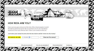
Global Rich List Site Snapshot

This is another example of a clean interface that does one thing and does it very efficiently.

Enjoy and let me know what you think of this site.

Web Trend Map 2007 Version 2.0

Speaking of Dashboards, check out this Web Trend Map 2007 by Information Architects Japan.

iA Web Trends Map 2007

It is a very neat way to show the trends in Web technology. It has got lots of information packed in, the one thing that I wish they could have done is to use the same colors as the tracks for the names so that it is obvious which name is associated with which track, otherwise, it is pretty darn good way to show a lot of information in one screen.

For people that are familiar with Tokyo Metro Map it conveys even more information than what is shown in the map. Like general conception of each station among the public to represent the website that resonates that opinion most. I have rarely seen portraying this kind of intangible dimension in presenting the information.

You can take a sneak peek at the 2008 trend map at Web Trend Map 2008 Sneak Peak.

I am also impressed with the way they are marketing this information, they are selling posters, ads embedded in the poster, puzzles etc. They could probably sell other usual merchandise like T-shirs, Mousepads, Cups, Jackets etc.

I am really excited about the innovative and the cool ways people are coming up with in presenting multiple dimensional data.

Stay tuned for more innovative Information Visualization sites.

Sunday, January 6, 2008

Sweet & Simple Dashboards

Lately I have been hearing a lot about Dashboards. I think they are very effective and a beautiful way to show the information that gets viewer attention.

For example, check out the Dashboards posted by Indianapolis Museum of Art site.

Here is a snapshot of the dashboards posted on this site:

Is not this a cool a way to present the data rather than a boring bulleted/numbered list?

Smart and Intuitive Cartography

Have you heard about GeoClip, a web-based GIS app. I just played with one of the samples Continental USA map listed on the Gallery page on this site.

For example, I have selected "pop. 25 years and older completed college, 2000" under Education as the theme for "Background analysis" and "personal income, 2002" under Income as the theme for "Foreground analysis" and zoomed to the "Portland - Seattle" area as shown below:

Tool bar provides such features as select an area to get more information, zoom by circle, zoom by rectangle, toggle city names on/off, toggle state boundaries on/off, overlay external data etc.

Other thing I like about this app is the wide array of display modes that it offers, check out this list on the Multiple themes page.

Even though it has many cool and intuitive features with very rich interface, the price of the products seems a little steep. For the Géoclip Solo version it costs €4,800 (€2,800 + €2,000) and for the Géoclip Server version it costs €12,500 (€3,000 + €9,500).

I wonder if there are any open source or cheaper applications that provide similar functionality. I have looked at some of the apps done using Open MapServer and none of them look as slick as GeoClip.
By the way, I am not associated with their website or product in anyway.

I would love to hear what you guys think about this app and/or any other similar app that you might know of.